Built for living , loved for a lifetime.
About Us

Lorem Ipsum is simply dummy text of the printing and typesetting industry.
A kitchen extension can add square footage, but that is rarely the real brief. More often, the aim is to change how the house feels – to bring in light, improve movement, create better sightlines and make everyday life noticeably easier. The best kitchen extension layouts do exactly that. They respond to the architecture of the home, the rhythm of family life and the way the room needs to perform from early breakfast to late-evening entertaining.
When a layout works, you notice it in small ways. Children can do homework at the island without blocking the cook. Guests gather with a drink and never end up underfoot. Garden views feel intentional rather than incidental. The room becomes calmer, better connected and more generous, even on an ordinary Tuesday.
The strongest layouts are rarely the most elaborate. They are the ones with a clear hierarchy: where cooking happens, where people sit, where circulation runs and where daylight is best enjoyed. That sounds simple, but in practice it requires discipline. A kitchen extension has to balance architecture, joinery, glazing, structure and furniture placement at the same time.
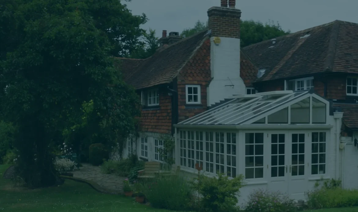
In period houses particularly, the extension should not feel like a separate add-on. It needs to negotiate between the proportions of the original building and the openness expected of modern living. Ceiling heights, thresholds, glazing lines and cabinetry all play a part. A beautifully made painted timber kitchen can help bridge that transition, giving the room a sense of permanence rather than a fitted-afterthought feel.
There is also the question of orientation. A south-facing extension may need shading and careful control of glare, while a north-facing space benefits from thoughtful roof glazing and a lighter palette. Layout is not only about where the island sits. It is about how the room performs in changing light, in different seasons and for different kinds of use.
For many households, the most successful solution is not fully open plan but intelligently broken plan. This approach keeps the sense of openness people want from an extension, while introducing subtle zoning through joinery, changes in ceiling treatment, glazed screens or shifts in furniture placement.
In practical terms, that might mean a kitchen at the heart of the extension, a dining area aligned with garden doors and a sitting space tucked slightly to one side. The room still reads as one generous whole, but each zone has a purpose and a degree of separation. Noise travels less. Cooking mess is less visually dominant. The sitting area feels inviting rather than stranded at the far edge of a large box.
This layout tends to suit family homes especially well because it accommodates parallel activities without forcing everything into one visual field. It also lends itself to more considered joinery, such as a dresser run, a bar cabinet or a painted timber library wall that helps the room feel furnished rather than merely fitted.
It is easy to understand the appeal of an island. It creates a social focal point, offers useful storage and gives the cook a more outward-looking position. Yet not every extension needs one, and not every room is improved by making the island the star.
The best island-centred layouts give proper allowance for circulation on every side and place the island in relation to both cabinetry and glazing. If it is too close to the garden doors, movement becomes awkward. If it is oversized, the room can feel dominated by one heavy object. If seating is forced onto the wrong edge, people end up facing a wall when they ought to be enjoying the garden or conversation.
Where an island does work, it often becomes the social bridge between kitchen and living space. Hob placement is one of the key decisions here. Some clients prefer the sink on the island, allowing uninterrupted eye contact while preparing food. Others prefer a clear island for serving and gathering, with cooking kept to a perimeter run. Neither is universally right. It depends on habits, ventilation strategy and how formal or relaxed the entertaining style tends to be.
Not every property lends itself to a broad rear extension. In many Victorian and Edwardian homes, width is constrained, and the challenge is to make a long, narrow footprint feel elegant rather than compressed. In these cases, one of the best kitchen extension layouts is a refined galley arrangement that opens into a dining or seating zone at the end.
This can be remarkably effective when the cabinetry is carefully proportioned and the visual clutter is kept under control. Tall storage grouped at one end helps avoid a corridor effect. A run of painted cabinetry opposite generous glazing can create a pleasing balance of solidity and light. The far end of the extension then becomes the release point – often a dining space beneath a roof lantern or beside slender garden doors.
The success of this layout depends on restraint. Too many finishes, too many interruptions in the cabinetry or too much furniture can make the room feel busy. But when designed with confidence, a narrower extension can feel intimate, polished and deeply liveable.
An L-shaped extension can solve several problems at once. It allows the kitchen to occupy one arm, while the second arm creates room for dining, lounging or a boot-room style transition. It also helps wrap the house around the garden, improving both outlook and access.
This format is especially useful where the existing internal layout is fragmented. By extending to the rear and side, it becomes possible to rework circulation entirely, replacing a series of smaller disconnected rooms with a more coherent living environment. The kitchen can remain anchored to the house, while the lighter, more garden-facing functions sit in the newer part of the plan.
From a design perspective, the corner is the critical moment. It should feel resolved, not accidental. Sometimes that is achieved through corner glazing; sometimes through cabinetry that turns elegantly and maintains visual calm. The architecture has to support the layout rather than compete with it.
One of the more quietly successful options is also one of the most overlooked. Instead of trying to make the extension house kitchen, dining and lounging all in one open expanse, some homeowners are better served by creating an exceptional kitchen-diner and leaving relaxation to a separate adjoining room.
This can be the right answer for clients who love entertaining around a table, want a highly functional cook space and do not necessarily need a television area within the extension itself. It keeps the proportions of the new room more disciplined and often results in a more elegant use of budget. Rather than spreading square footage thinly across too many functions, the design can focus on quality of finish, bespoke joinery and architectural detail.
For period properties, this arrangement can feel particularly appropriate. It respects the natural character of the house while still delivering the openness and garden connection that modern life calls for.
The best kitchen extension layouts are shaped as much by behaviour as by architecture. Before fixing on islands, banquettes or bifold alternatives, it helps to ask a few sharper questions. Do you cook seriously and often, or is the kitchen primarily social? Do you want children close by, or would you rather maintain separation between play and preparation? Is the dining table used daily, or only at Christmas and birthdays?
There are also practical realities. Structural walls, drainage runs, rooflines and planning considerations may naturally favour one arrangement over another. This is where an integrated design-and-build approach becomes so valuable. When architectural design, technical detailing and joinery are considered together from the outset, the final layout tends to feel far more resolved.
At the premium end of the market, materials matter as well. Painted timber cabinetry brings depth, softness and character that sit beautifully within both heritage and contemporary settings. In an extension with strong natural light, those details become even more apparent – the way colour responds through the day, the way cabinetry grounds a glazed elevation, the way craftsmanship gives the room its sense of permanence.
A larger extension is not automatically a better one. Some of the most impressive kitchen spaces are not vast, but well judged. They give enough room for movement, enough storage for daily life and enough breathing space around furniture. Crucially, they avoid that uncomfortable middle ground where a room is big enough to echo but not big enough to zone properly.
Good proportion is what makes a space feel composed. It influences the width of walkways, the size of an island, the relationship between cabinetry and glazing, and even how comfortable a dining table feels in use. This is where thoughtful design distinguishes a genuinely luxurious extension from one that is merely large.
For homeowners investing in a lasting transformation, that distinction matters. A kitchen extension should not only photograph beautifully on completion. It should continue to support family life, entertaining and quiet daily routines for years to come, with every threshold, cabinet line and sightline working harder than it first appears.
The right layout is the one that makes your home feel as though it was always meant to live this way – lighter, calmer and built for living, loved for a lifetime.